Color is often treated as the last layer of a room, something chosen after the plan, furniture, and materials are settled. It can do more. A darker recess may give a wall depth, one continuous tone may quiet a complicated edge, and a contrasting door can mark a transition between spaces. Used with an understanding of light and geometry, color helps people read the architecture of a home. The aim is not to make every wall a statement. Color is most effective when it responds to what is already there: daylight, ceiling height, openings, joinery, floor materials, and the routes people take. A considered scheme can be bold or restrained. In both cases it begins with observation and full-scale sampling, because a small color chip cannot show how a room will behave through the day.
Read the room before selecting a shade
Stand at the doorway and identify the main forms: long walls, recesses, beams, window openings, built-in storage, and the line where wall meets ceiling. Which of these should become more visible, and which should recede? Color can strengthen a room's proportions or make them feel fragmented. The answer should come from the spatial experience you want, not from a fashionable palette viewed in isolation.
Observe the room at the hours it is used. A north-facing wall, a sunlit niche, and a shaded corridor may make the same paint appear different. Artificial light changes the result again in the evening. Note whether the room feels flat, busy, narrow, or disconnected from its neighbors. These descriptions give color a job to do.
Inventory fixed elements before sampling: floor, stone, tiles, window frames, cabinetry, and large furniture. Their tones influence every new choice. A color can look balanced on a blank sample board and uncomfortable beside a warm floor. Selecting within the context of the room makes even a simple scheme feel more intentional.
Use value to reveal shape
Value describes how light or dark a color appears. A darker surface can visually recede or create a sense of enclosure, while a lighter one may make a form more prominent under daylight. The effect depends on adjacent surfaces and lighting, not on a fixed rule. A dark alcove can give a shallow wall depth; a light wall beside a darker floor can emphasize the height of a room.
Test how the eye moves across the space. If a room has several competing doors and cabinets, painting them in related values may calm the composition. If an architectural feature deserves attention, a controlled contrast can reveal it. Avoid adding contrast to every edge. When everything is outlined, the architecture may become harder to read.
Think about large surfaces together. A ceiling, wall, and trim can form one continuous volume or several distinct planes. Neither approach is automatically better. In a compact room, continuity may reduce visual breaks; in a large room, a contrasting ceiling can change the sense of scale. Sample enough area to see the form, not only the hue.
Let color guide movement through a home
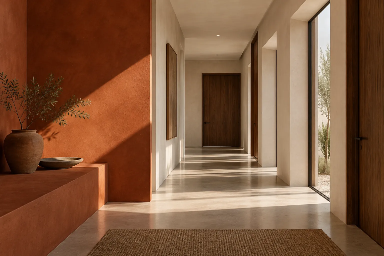
Color can mark a threshold between activities. An entry in a deeper tone may make a brighter living room feel open on arrival. A quiet color in a study can signal focus, while a related tone in an adjoining hall maintains continuity. These relationships are more powerful when they follow the route people actually take rather than assigning a separate theme to every room.
Stand where two or three spaces are visible at once. Colors that seem successful individually may compete in a long sightline. A limited family of tones can help the eye travel, with one stronger moment reserved for a destination. Repeating a color in a smaller detail elsewhere can create a connection without painting entire rooms alike.
Transitions need thoughtful edges. Decide whether a color change happens at a corner, within a doorway, or at another architectural line. An arbitrary stop can look accidental and be difficult to finish neatly. The boundary should make sense with the shape of the building and with how the space is experienced in movement.
Decide whether trim should stand out or recede
Traditional contrasts between wall and trim can give a room clear outlines. That may be appealing when doors and moldings have good proportions. In a space with many small edges, the same contrast can make the walls feel busy. Painting trim and wall in a related tone can create a calmer field while allowing changes in finish to provide subtle definition.
Look at the whole sequence of doors and windows. If one door is emphasized while several others are not, it may become a useful marker or an unintended distraction. A built-in cabinet can be painted to recede into a wall, or given contrast so it reads as furniture. Choose according to its role and visual weight.
Finish matters as well as color. Surfaces with different sheens reflect light differently and may require different care. Ask for product guidance appropriate to the location and expected wear. A beautiful matte wall in a high-touch passage may need a cleaning approach that suits the household. The goal is an appearance that remains satisfying in use, not only after painting.
Connect paint to the material palette
Paint is seen beside flooring, timber, stone, textiles, and metal. Undertones that are subtle on a sample can become obvious at these junctions. Place several candidate colors next to the fixed material rather than on a white board alone. Look at them in daylight and evening light, and move the sample to different parts of the room. A wall can have more than one lighting condition across its length.
Avoid assuming that all neutrals are interchangeable. One may lean warm next to a gray stone, another cool beside honey-colored timber. The relationship matters more than the label on a color card. A saturated shade also changes with its surroundings: deep green may feel calm beside warm wood and much sharper beside a cool, glossy surface.
Texture can carry part of the palette. A rough wall, woven fabric, and smooth cabinet in related colors will still create depth because they respond differently to light. This can be more enduring than adding several unrelated accent colors. The materials should feel connected without becoming a perfectly matched set.
Sample at a scale large enough to judge
A small chip is useful for narrowing options, not for making the final decision. Paint a large movable board or a generous test area, following the product's instructions. Place it on more than one wall and view it at morning, afternoon, and night. Notice what happens at corners and beside flooring. A color that looks quiet in one location may become surprisingly strong across a full surface.
Compare a few finalists rather than surrounding the room with dozens of patches. Too many samples alter the visual context and make judgment harder. Use a neutral background around test boards if needed. If a shade almost works, ask whether the problem is the hue, its lightness, the finish, or the material beside it. This diagnosis is more useful than randomly selecting another chip.
Take time before ordering the full quantity. Color is relatively easy to change compared with architecture, but repainting an entire room still requires effort and disruption. A few days of observation can prevent the common experience of liking a sample at noon and disliking the room every evening.
When testing, include the area where the wall meets a ceiling or door frame. Those junctions reveal whether a color makes a feature feel crisp, heavy, or disconnected. View the sample with lamps switched on and off, and with window treatments in their usual position. If the room is shared, ask others what they notice without telling them which sample you prefer. The goal is not unanimous enthusiasm for one chip, but a better understanding of how the color affects ordinary activities. A sample that looks dramatic in a single photograph may feel tiring over a long evening, while a quieter one may reveal more depth as light changes.
Use bold color where it has a reason
A strong color can make a recess, stair, doorway, or built-in feel deliberate. It can also give a room a distinctive atmosphere. Choose the area because of its architectural role, not because a blank surface seems to require a feature. A small, saturated zone may draw attention to a destination; a whole room in the same color may create a more immersive effect.
Consider the view from neighboring spaces and the objects that will sit against the color. Art and furniture may become more vivid on a deep wall, but some pieces may disappear. A bold wall beside a highly patterned rug can be exciting or exhausting depending on the relationship. Test the combination with actual samples and the lighting used in the room.
There is no requirement for a bold choice to be permanent. Paint can be changed, and smaller movable elements can introduce a color before it becomes architectural. If uncertainty is high, try a curtain, chair, or artwork in the proposed tone and observe whether you enjoy living with it. Confidence should come from experience, not pressure to make a statement.
If a bold color is used to mark a threshold, consider what happens on both sides of it. A saturated doorway may frame the room beyond beautifully, but it can also make the adjacent wall look unexpectedly pale or cool. Stand in each room and look back. The transition should have a reason from both directions. A strong color can also shift the apparent scale of furniture; a pale sofa may become more prominent against it, while a dark cabinet may blend in. These relationships are easier to judge with real objects in place than with digital renderings. Let the architecture and furnishings participate in the decision.
Keep a coherent palette without making every room identical
A home can have variation while still feeling connected. Choose a small number of recurring ideas: a warm wall tone, a deeper accent, a timber family, or a particular approach to trim. Each room can respond to its light and use within that framework. An intimate bedroom may take a deeper version of a color seen in a bright living area; a corridor may carry a quieter link between them.
Photograph sightlines between rooms and place samples where they are visible together. This helps reveal abrupt changes that may not be apparent when considering one room at a time. If a strong color appears only once, it can still belong if it responds to the architecture or is echoed by an object elsewhere. Coherence is a relationship, not uniformity.
Leave space for materials and daily objects to contribute. If every room has a distinct painted feature, the architecture may lose a sense of rest. A restrained background can let daylight, furniture, and art do more. The balance should fit the household's appetite for visual energy and the building's own character.
Review color after the room is furnished
Paint selection does not end when the walls dry. Furniture, rugs, and lighting change how a color is perceived. A wall that looked too plain in an empty room may become exactly right once textured upholstery and art arrive. A shade that seemed subtle may feel stronger when repeated across curtains or cabinetry. Give the finished room some time before making another color change.
Check how the color behaves in ordinary use. Does it show marks near switches or seating? Does it make an evening corner too dark for its tasks? Can the finish be cleaned according to the maker's guidance? Practical experience may suggest a lighting or furniture adjustment rather than a new paint color. Avoid blaming the shade for a problem created by glare or poor placement.
Color works best when it clarifies what is already good about the architecture and makes daily spaces pleasant to inhabit. Sample in the real room, decide which forms deserve emphasis, and allow the material palette and light to shape the final judgment. The result can be expressive without being noisy and calm without being anonymous.
Sample in the real room at several times of day and decide which forms should stand out.
These are general design considerations. Product dimensions, materials, installation requirements, and care instructions should be checked with the relevant maker or professional before purchase or work begins.